Sign in Solutions:
Workspace
Mobile first office management & desk booking web-app
Timeline
2021 → 2023
Role
Product Designer
Team
Research & Development
Tech stack
Figma, Reactjs, Typescript & TailwindCSS
Overview
At Sign In Workspace (formerly Pronestor), we set out to reimagine how hybrid employees interact with their office environment. As companies shifted toward flexible work, existing tools for desk booking and office management felt clunky, disconnected, and ill-suited for mobile-first use.
Together with developers, stakeholders, and product owners, I led the end-to-end redesign of both the employee-facing booking experience and the admin-focused back office. From personalized desk recommendations and live interactive maps to seamless check-ins and week-overview dashboards, the result was a cohesive, modern web app that brought personalisation, clarity, flexibility, and visibility to the hybrid workplace.
The Problem
As hybrid work became the new normal in the wake of COVID-19, companies struggled to give their employees clear visibility into who was working where and when.
For our user base, there was no easy way to see which desks were available, who was in the office, or to communicate their own whereabouts. This created friction in daily planning, collaboration, and overall workplace coordination.
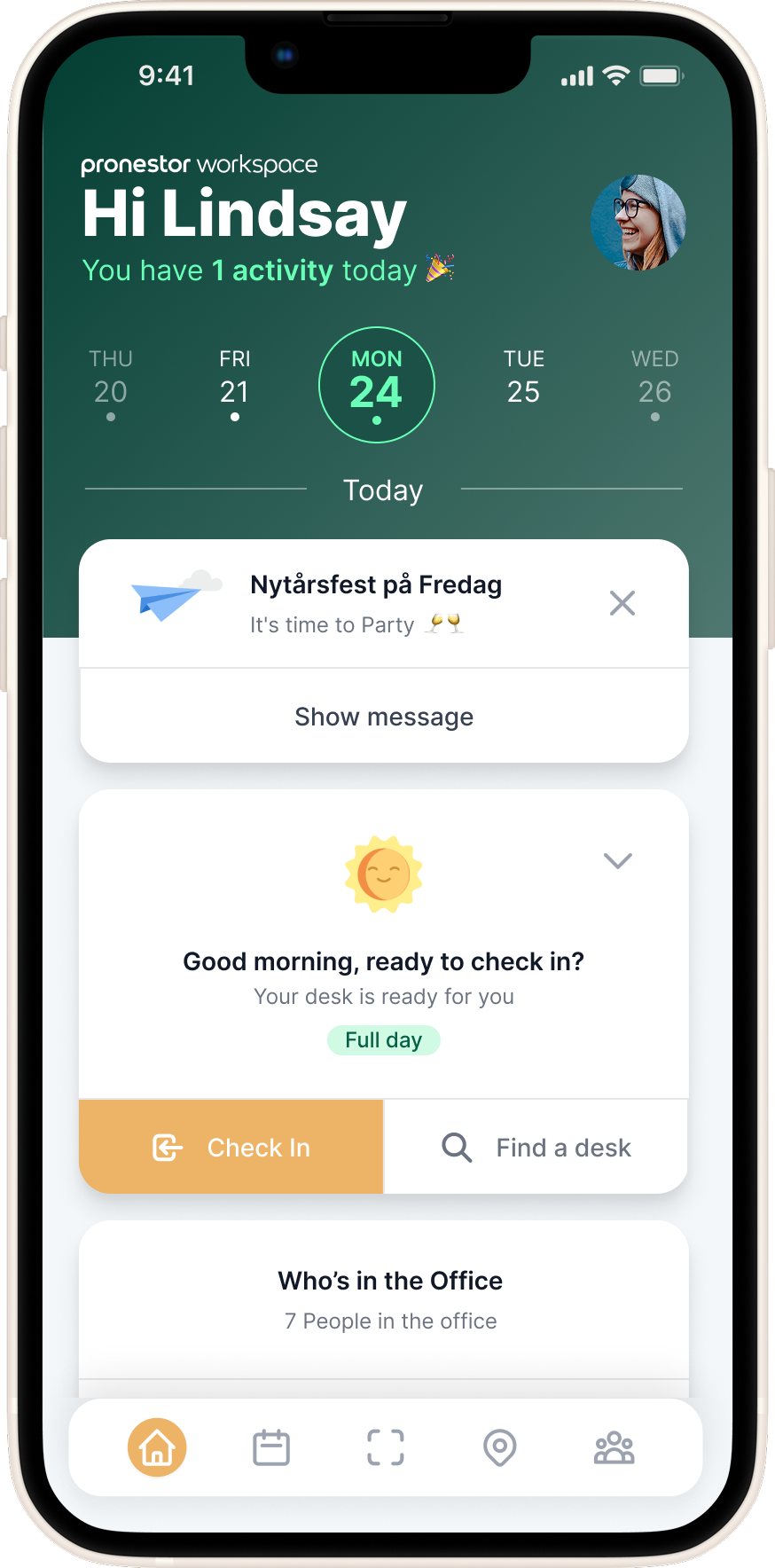
Employees needed a simple way to check in, indicate their work location (office, remote, or out), and quickly book a desk, whether through suggested options or scanning a QR code. Without this, the modern office felt disjointed, inefficient, and hard to navigate.
The Solution
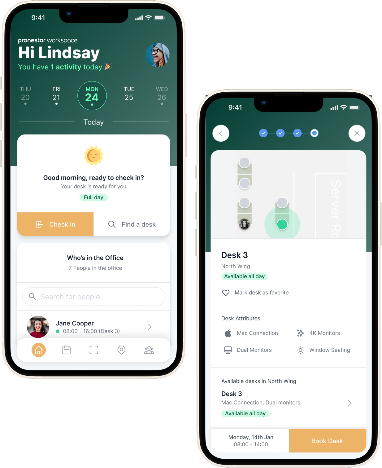
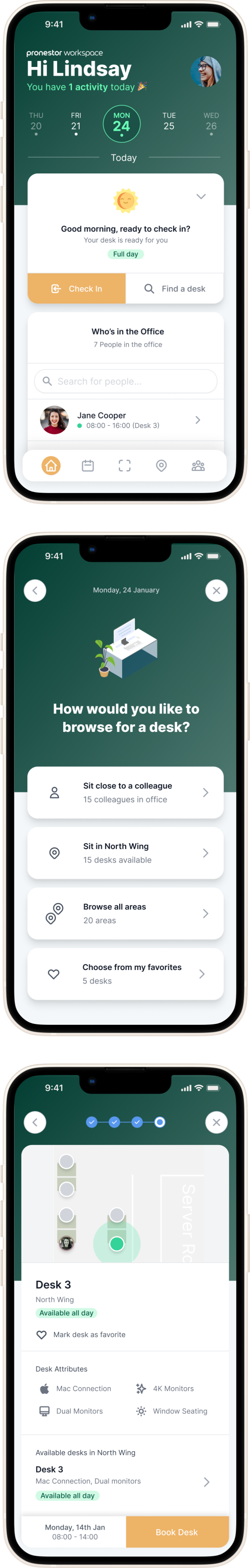
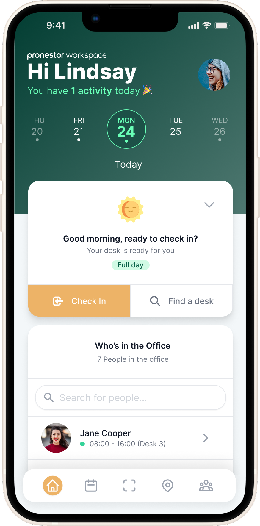
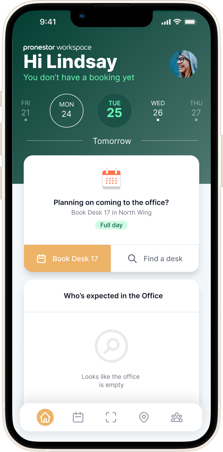
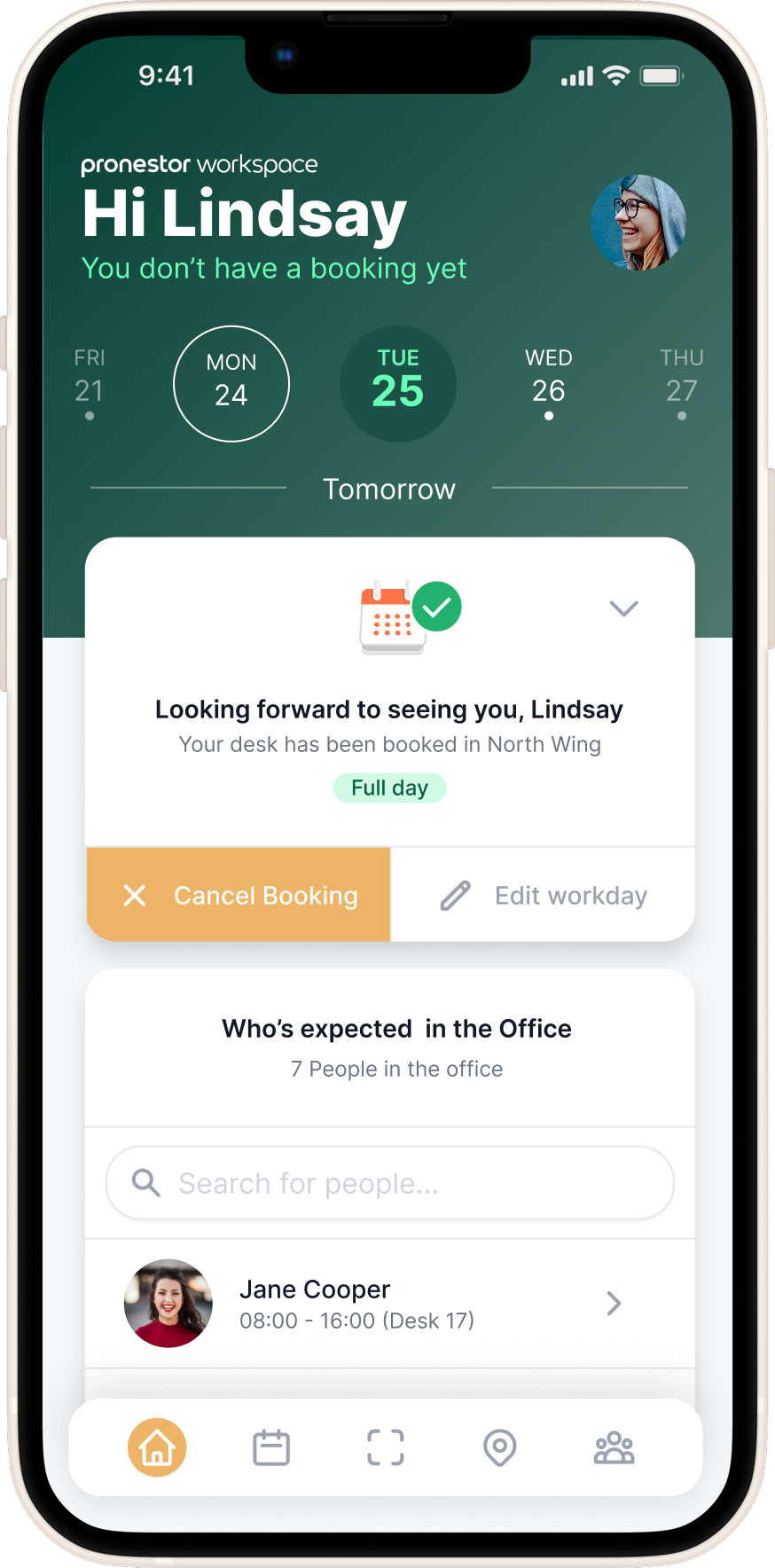
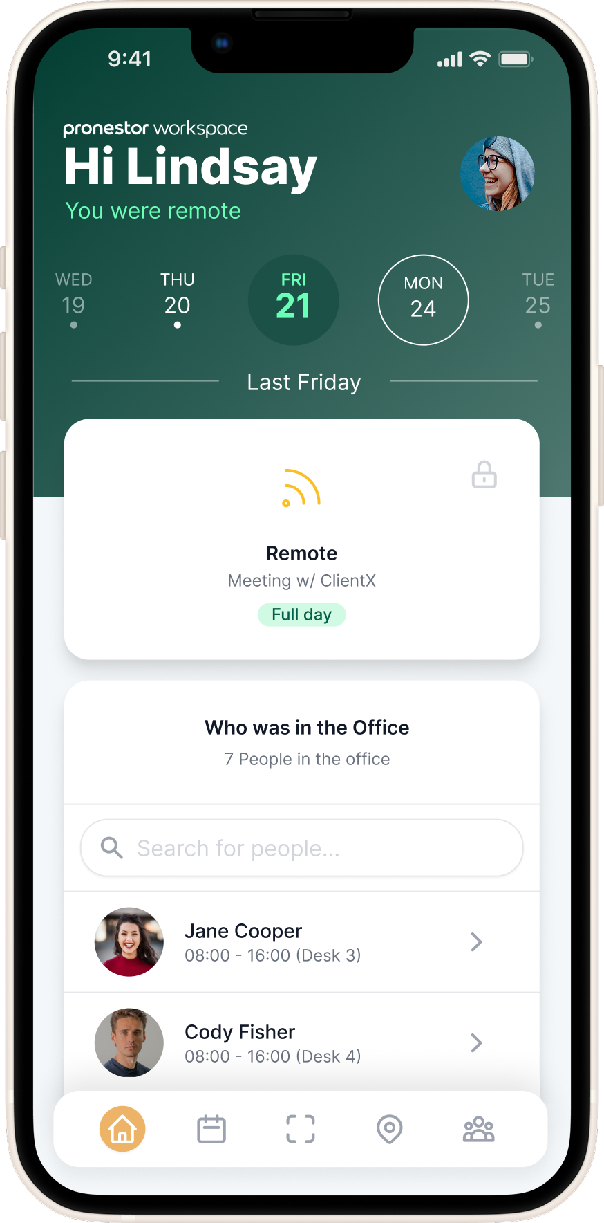
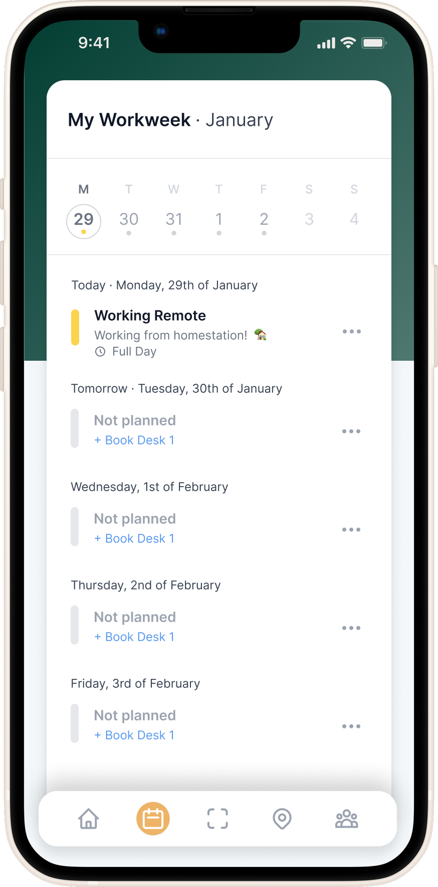
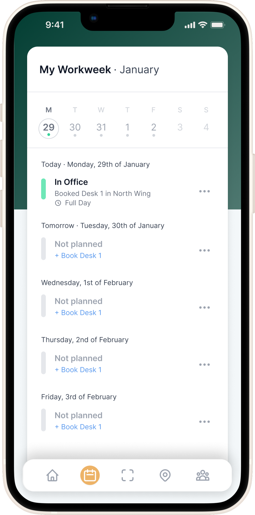
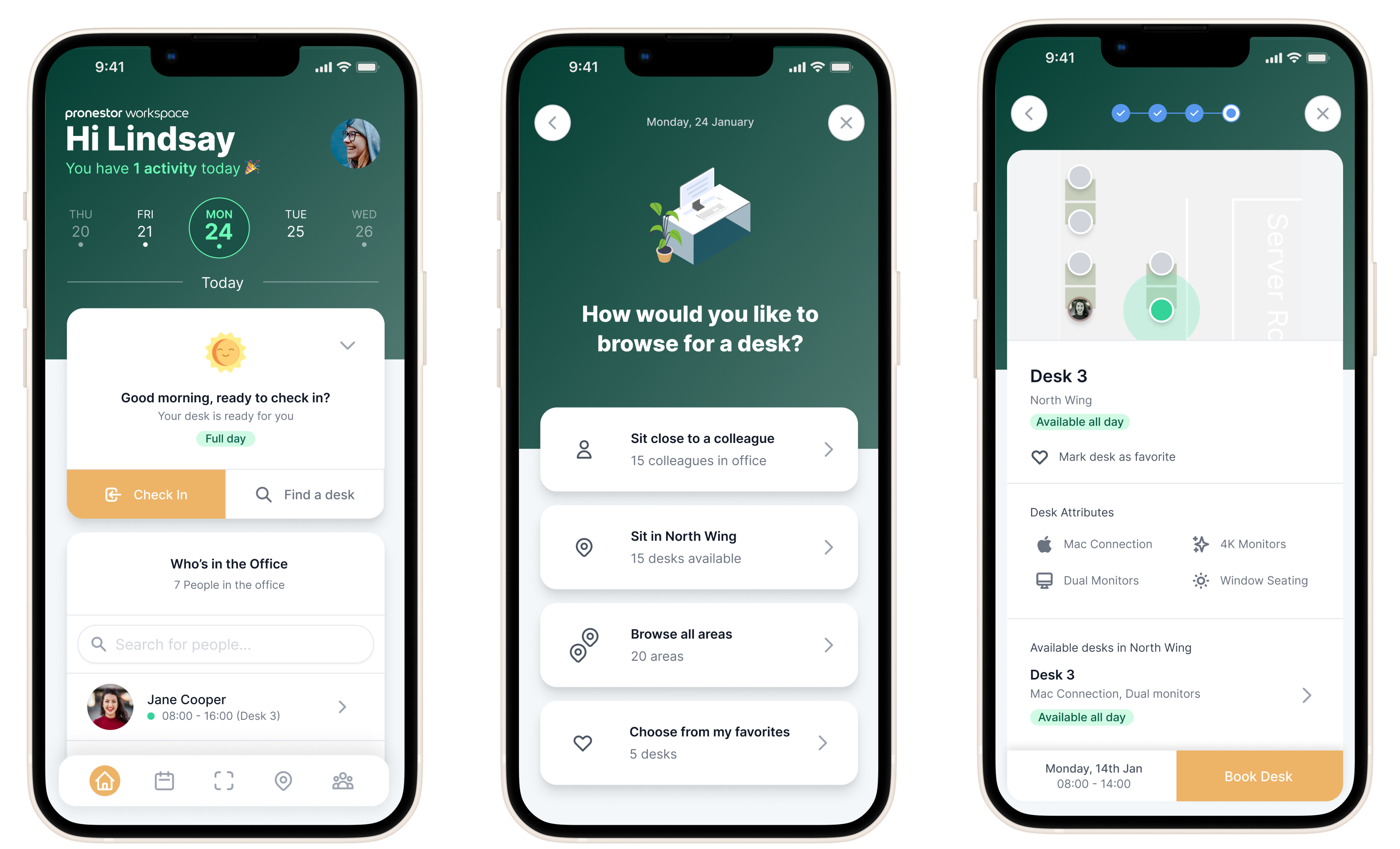
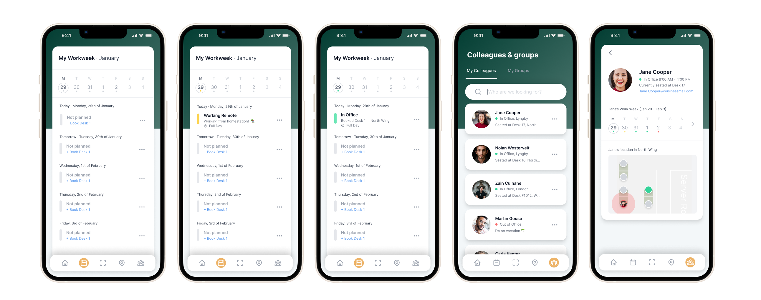
Front Office: A Mobile-First Office Companion
To support the needs of hybrid employees, we designed a mobile-first web app focused on making the modern workplace feel accessible, connected, and flexible.
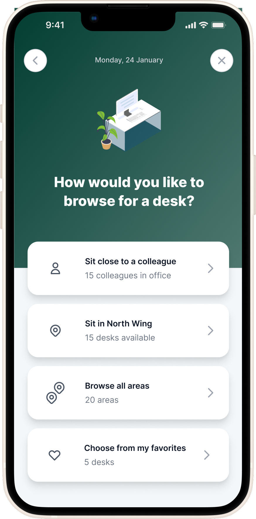
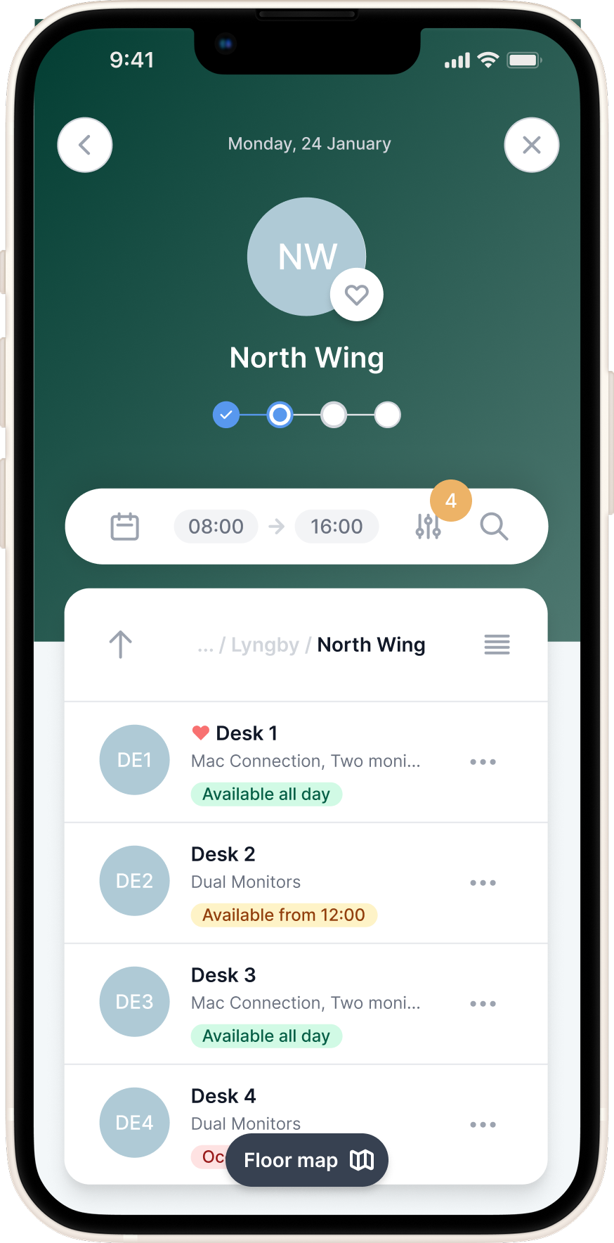
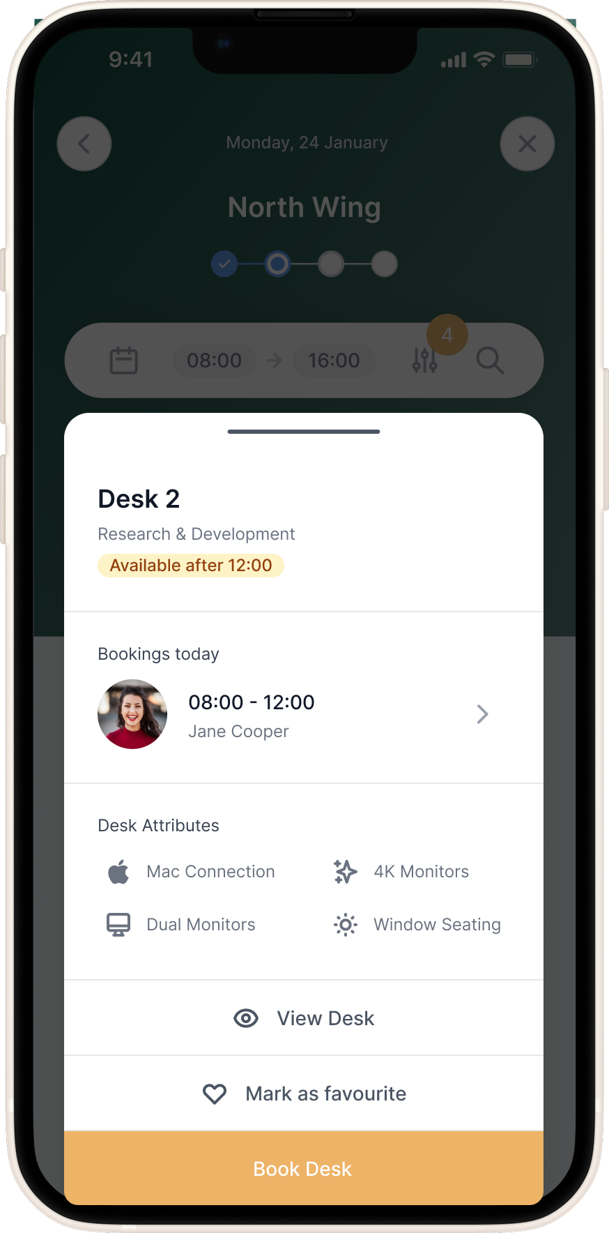
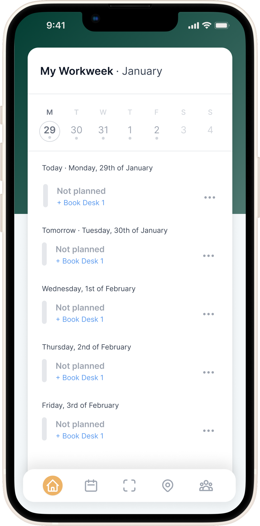
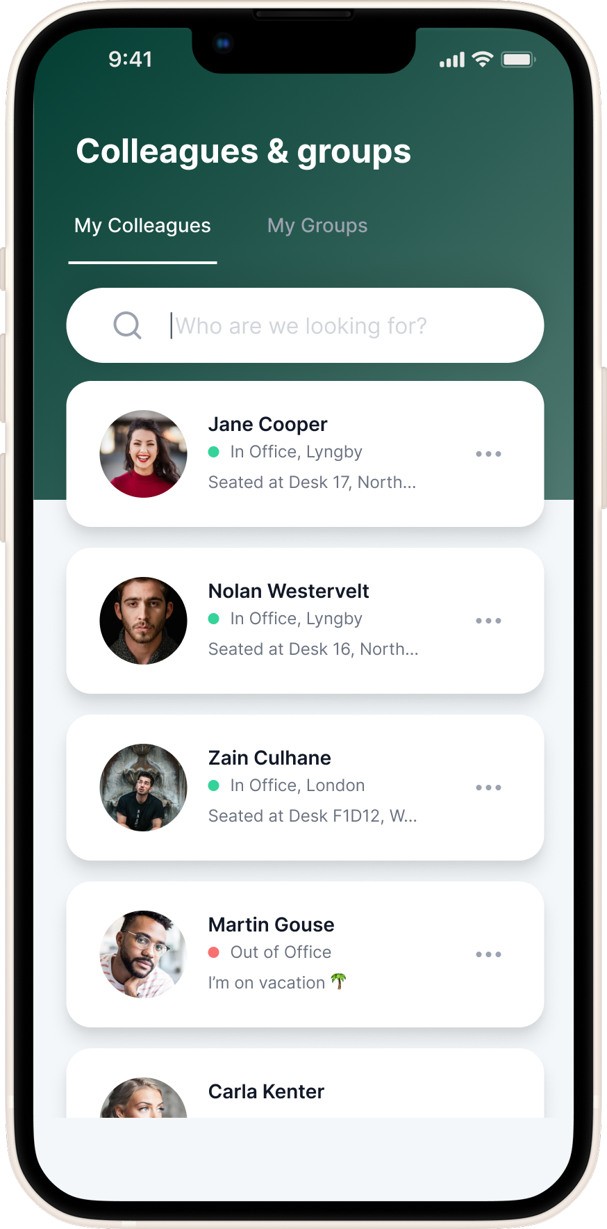
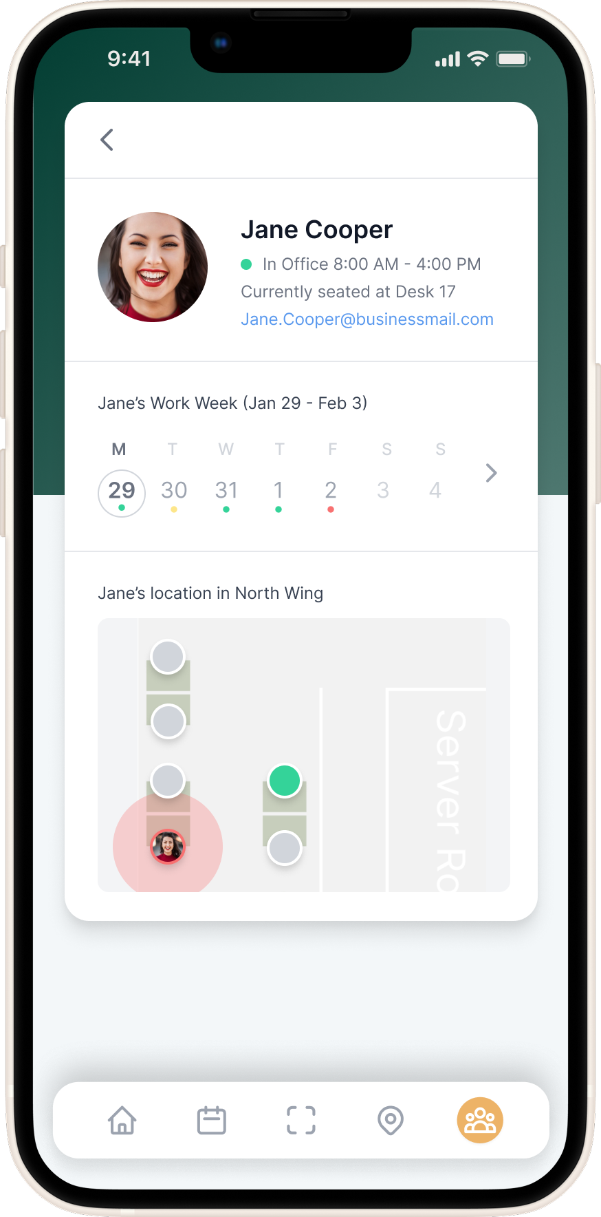
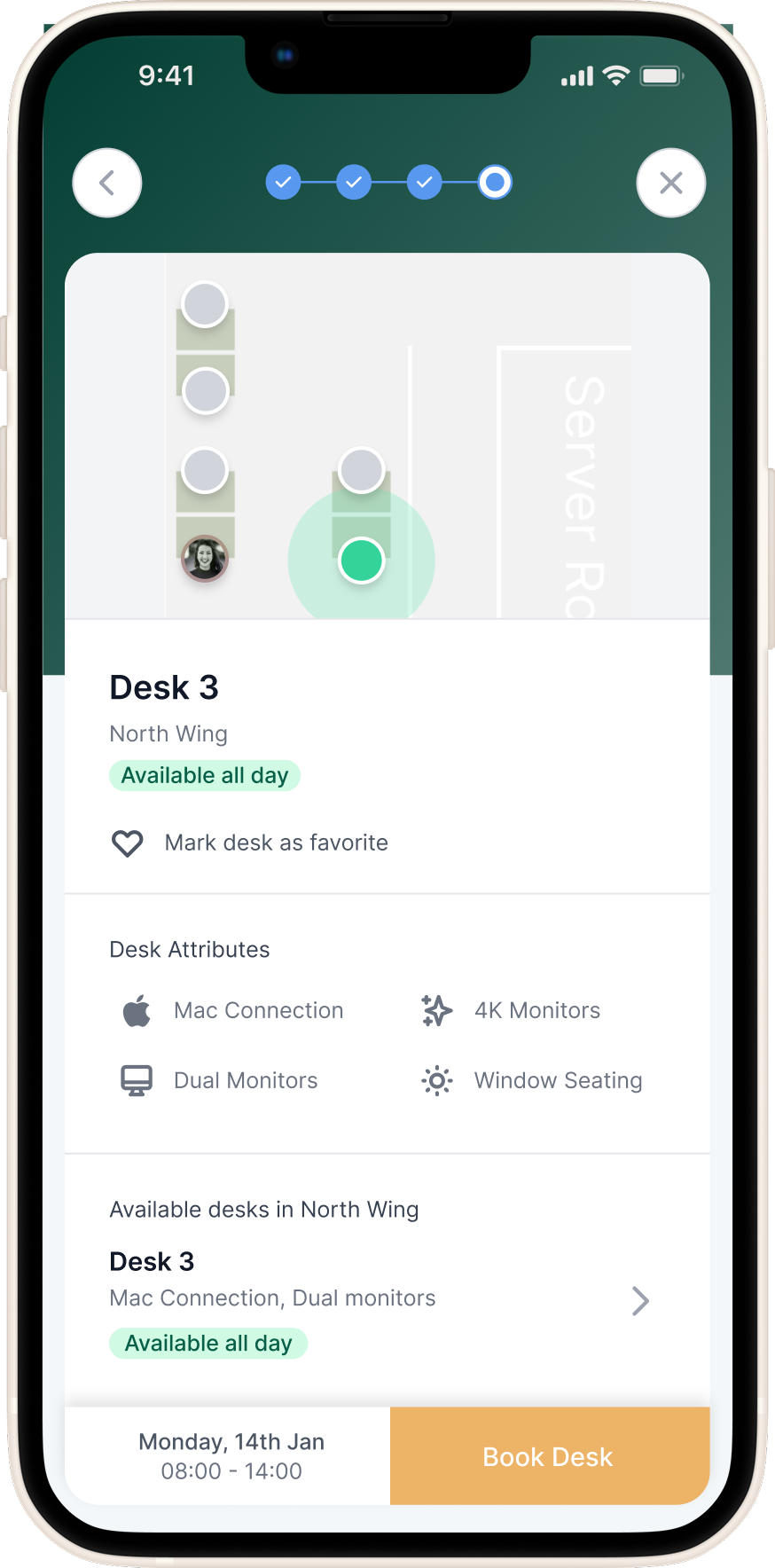
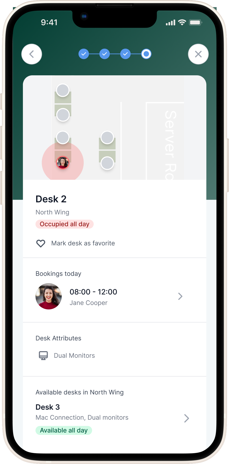
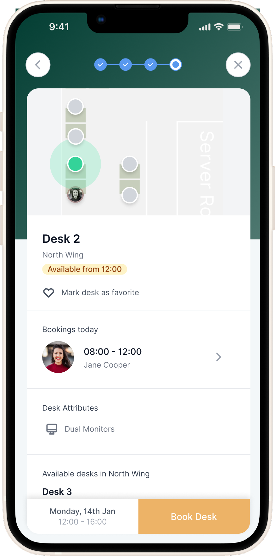
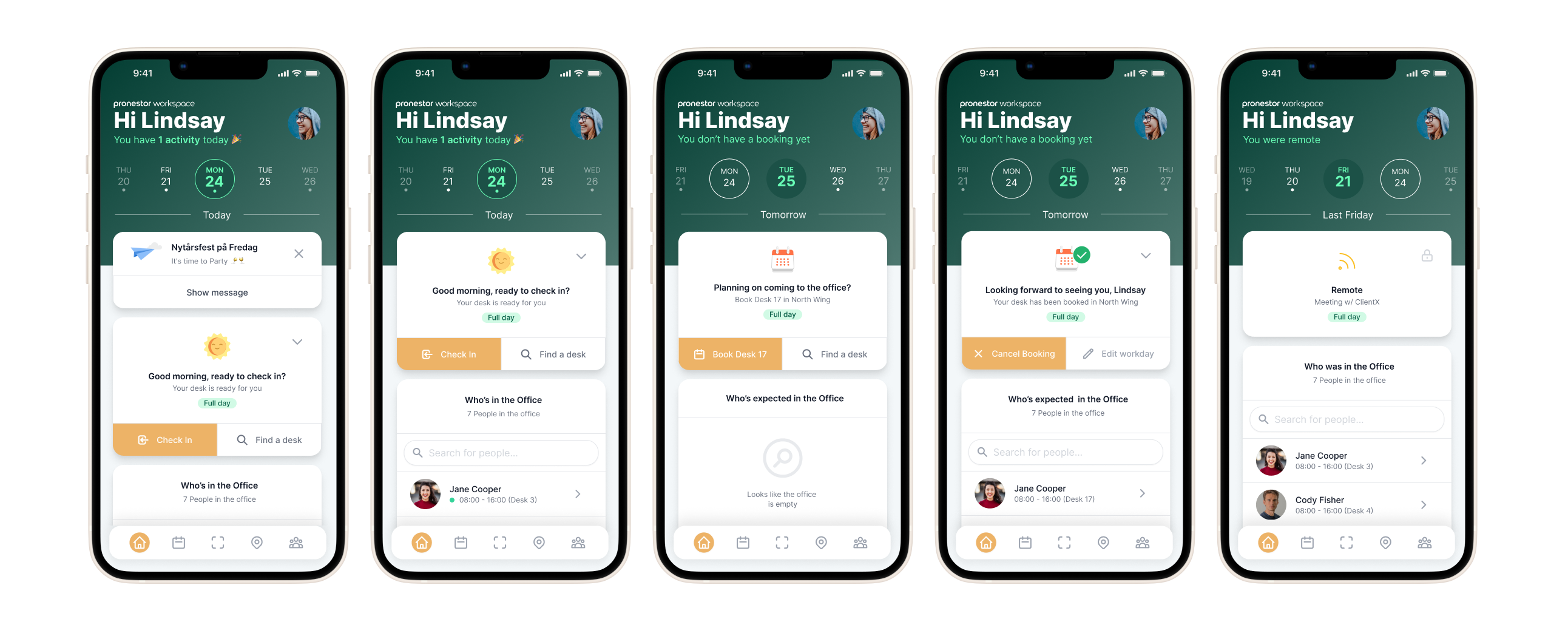
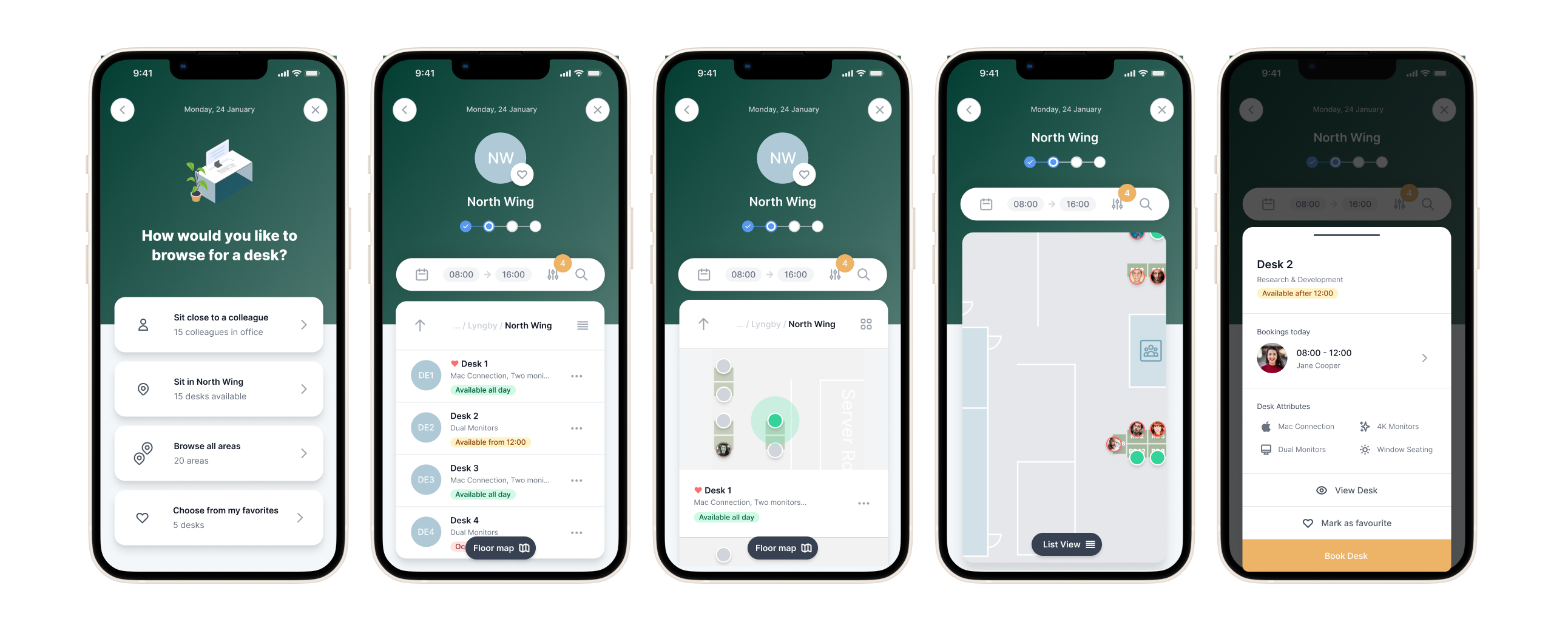
The front office experience acted like a digital receptionist, helping users plan their workweek, book desks, and see who would be in the office. Through suggested desks, favourites, or scanning a QR code, employees could quickly reserve a workspace that suited their needs.
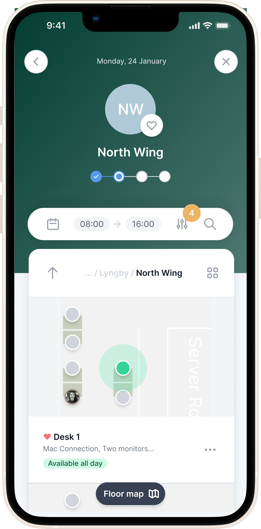
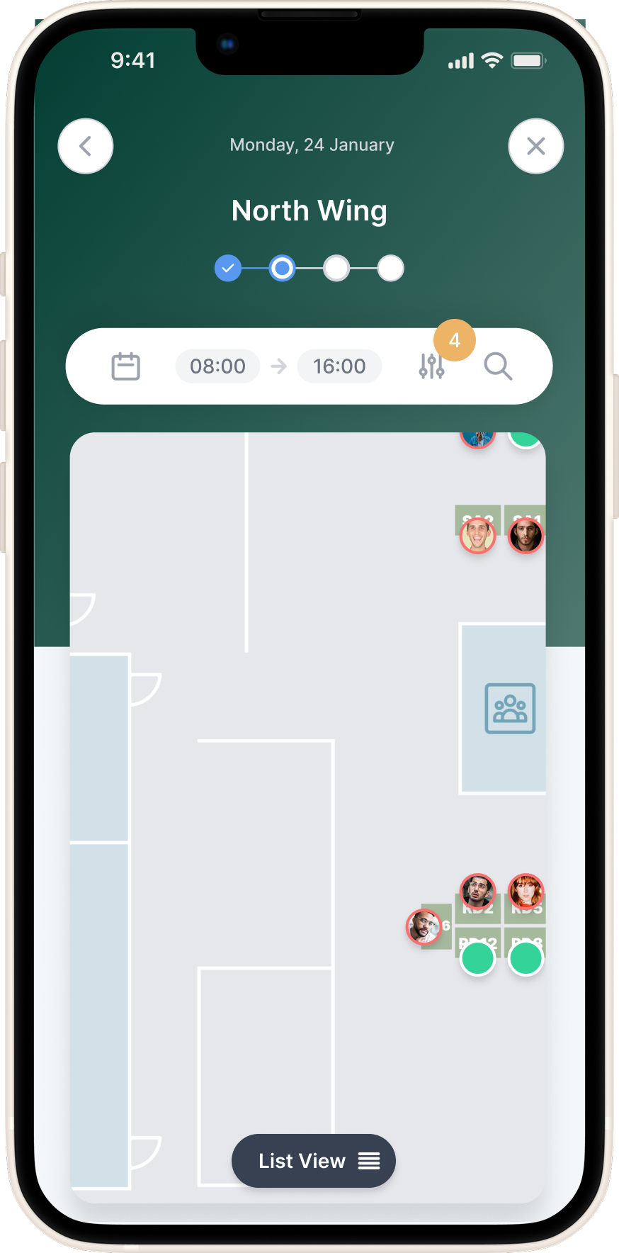
An interactive office map allowed them to visualise seating arrangements and spot available desks in real time, while a colleagues view gave visibility into where teammates were sitting on any given day. It wasn’t just about booking — it was about fostering presence and connection in a hybrid environment in a easy and user-friendly way.
Back Office: Total Control for Office Managers
The back office was a desktop-only admin interface designed to give workplace managers full control over their physical space and organizational structure. Here, admins could create and manage desks, set up departments, assign user roles, and configure location rules that aligned with company needs. One of the most powerful features was the ability to upload and edit interactive floor plans — exported directly from Figma — allowing office maps to remain visually accurate and up to date. This ensured that the live maps employees used in the front office reflected the real world, making desk booking intuitive and planning effortless.
Approach overview
- Client & Internal Insights:
Direct user testing was limited during the project, but we relied on extensive feedback gathered over the years from Workspace’s existing client base. The product had already been in use in a basic form, and our support team provided valuable insights into recurring pain points. Early in my time at the company, we introduced a temporary visual refresh, internally referred to as “lipstick on a pig”, to modernise the interface while buying time to properly rethink the user experience from the ground up.
- Stakeholder Collaboration:
Close collaboration with internal stakeholders, including the product owner, CTO, developers, and customer support, helped validate assumptions and align priorities. Whiteboard sessions were key in shaping early wireflow concepts, and support insights ensured we stayed grounded in real-world user needs.
- Design Tools & Process:
I introduced Figma as the primary design tool, centralising everything from wireframes to handoffs and workshop collaboration. After validating wireframe prototypes through internal testing, we accelerated delivery by adopting TailwindUI as a design foundation — enabling rapid iteration without sacrificing consistency or scalability.
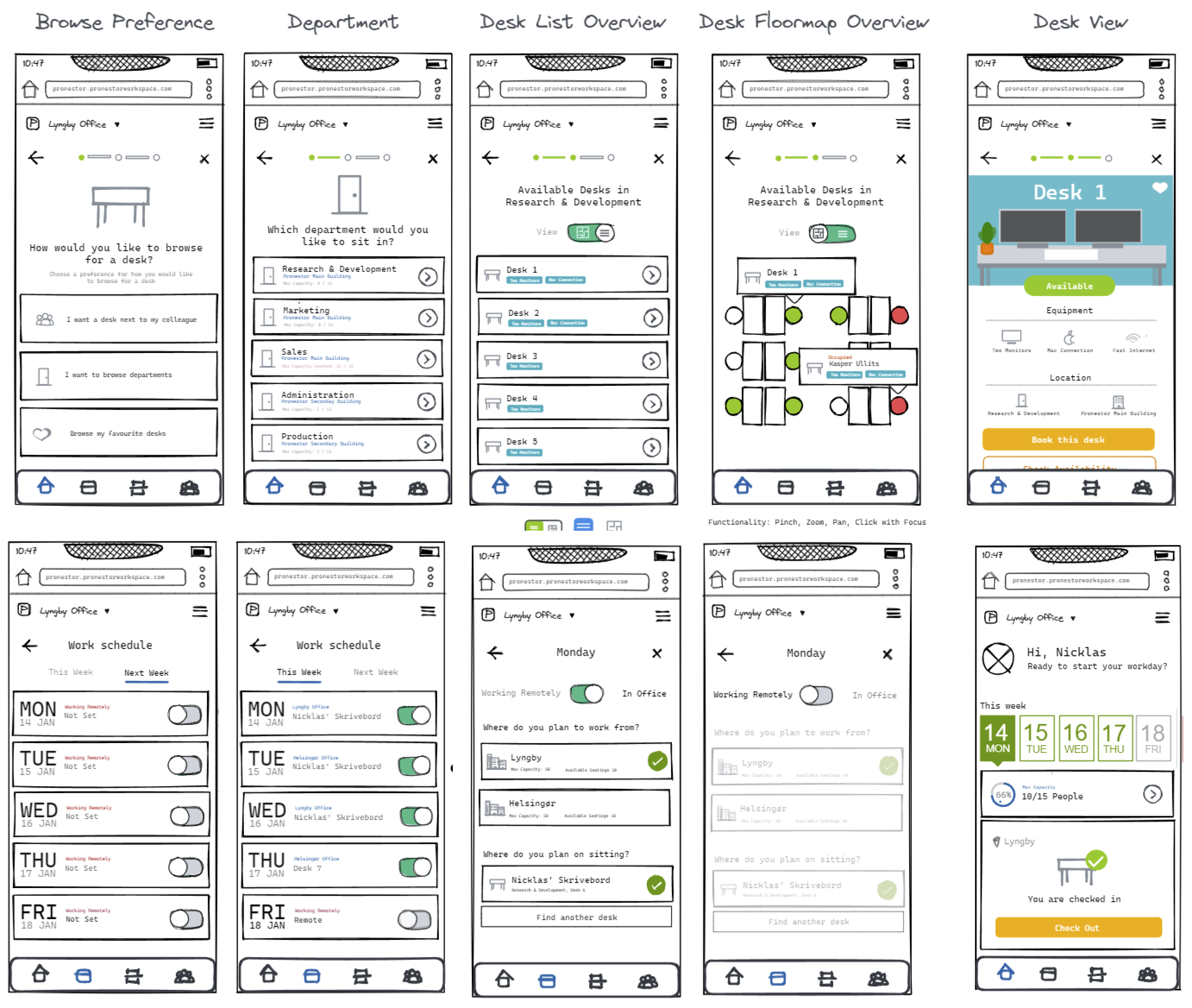
Initial wireframes

High-fidelity mockups
Conclusion
Sign In Workspace was an ambitious product redesign that helped reshape how hybrid employees planned their workdays and how office managers managed dynamic seating environments. We delivered a mobile-first, map-driven booking platform alongside a flexible admin experience, creating a much-needed sense of clarity in an uncertain post-COVID workplace.
Unfortunately, shortly after launch, I was among several team members impacted by company-wide layoffs. As a result, we didn’t have the opportunity to conduct structured post-launch research to further evolve the product. Had the project continued, the next steps could have included:
- Conducting usability testing to validate real-world task completion and ease-of-use
- Running satisfaction surveys (e.g., SUS or NPS) to benchmark user sentiment over time
- Performing clickstream and heatmap analysis to understand how people navigated the system
- Hosting follow-up interviews to capture deeper qualitative feedback from different user types
- Prioritising iterative improvements based on live usage data and behavioral patterns
Despite its early handoff, Sign In Workspace remains a defining project in my career.
It showcased the impact of aligning strategic design with real user needs, and the value of thoughtful UX in shaping the modern workplace.

Go back
Go back
Nicklas D. Sommer
Go back
Sign in Solutions:
Workspace
Mobile first office management & desk booking web-app
Timeline
2021 → 2023
Role
Product Designer
Team
Research & Development
Tech stack
Figma, Reactjs, Typescript & TailwindCSS
Overview
At Sign In Workspace (formerly Pronestor), we set out to reimagine how hybrid employees interact with their office environment. As companies shifted toward flexible work, existing tools for desk booking and office management felt clunky, disconnected, and ill-suited for mobile-first use.
Together with developers, stakeholders, and product owners, I led the end-to-end redesign of both the employee-facing booking experience and the admin-focused back office. From personalized desk recommendations and live interactive maps to seamless check-ins and week-overview dashboards, the result was a cohesive, modern web app that brought personalisation, clarity, flexibility, and visibility to the hybrid workplace.
The Problem
As hybrid work became the new normal in the wake of COVID-19, companies struggled to give their employees clear visibility into who was working where and when.
For our user base, there was no easy way to see which desks were available, who was in the office, or to communicate their own whereabouts. This created friction in daily planning, collaboration, and overall workplace coordination.
Employees needed a simple way to check in, indicate their work location (office, remote, or out), and quickly book a desk, whether through suggested options or scanning a QR code. Without this, the modern office felt disjointed, inefficient, and hard to navigate.
The Solution
Front Office: A Mobile-First Office Companion
To support the needs of hybrid employees, we designed a mobile-first web app focused on making the modern workplace feel accessible, connected, and flexible.
The front office experience acted like a digital receptionist, helping users plan their workweek, book desks, and see who would be in the office. Through suggested desks, favourites, or scanning a QR code, employees could quickly reserve a workspace that suited their needs.
An interactive office map allowed them to visualise seating arrangements and spot available desks in real time, while a colleagues view gave visibility into where teammates were sitting on any given day. It wasn’t just about booking — it was about fostering presence and connection in a hybrid environment in a easy and user-friendly way.
Back Office: Total Control for Office Managers
The back office was a desktop-only admin interface designed to give workplace managers full control over their physical space and organizational structure. Here, admins could create and manage desks, set up departments, assign user roles, and configure location rules that aligned with company needs. One of the most powerful features was the ability to upload and edit interactive floor plans — exported directly from Figma — allowing office maps to remain visually accurate and up to date. This ensured that the live maps employees used in the front office reflected the real world, making desk booking intuitive and planning effortless.
Approach overview
- Client & Internal Insights:
Direct user testing was limited during the project, but we relied on extensive feedback gathered over the years from Workspace’s existing client base. The product had already been in use in a basic form, and our support team provided valuable insights into recurring pain points. Early in my time at the company, we introduced a temporary visual refresh, internally referred to as “lipstick on a pig”, to modernise the interface while buying time to properly rethink the user experience from the ground up.
- Stakeholder Collaboration:
Close collaboration with internal stakeholders, including the product owner, CTO, developers, and customer support, helped validate assumptions and align priorities. Whiteboard sessions were key in shaping early wireflow concepts, and support insights ensured we stayed grounded in real-world user needs.
- Design Tools & Process:
I introduced Figma as the primary design tool, centralising everything from wireframes to handoffs and workshop collaboration. After validating wireframe prototypes through internal testing, we accelerated delivery by adopting TailwindUI as a design foundation — enabling rapid iteration without sacrificing consistency or scalability.
Initial wireframes
High-fidelity mockups
Conclusion
Sign In Workspace was an ambitious product redesign that helped reshape how hybrid employees planned their workdays and how office managers managed dynamic seating environments. We delivered a mobile-first, map-driven booking platform alongside a flexible admin experience, creating a much-needed sense of clarity in an uncertain post-COVID workplace.
Unfortunately, shortly after launch, I was among several team members impacted by company-wide layoffs. As a result, we didn’t have the opportunity to conduct structured post-launch research to further evolve the product. Had the project continued, the next steps could have included:
- Conducting usability testing to validate real-world task completion and ease-of-use
- Running satisfaction surveys (e.g., SUS or NPS) to benchmark user sentiment over time
- Performing clickstream and heatmap analysis to understand how people navigated the system
- Hosting follow-up interviews to capture deeper qualitative feedback from different user types
- Prioritising iterative improvements based on live usage data and behavioral patterns
Despite its early handoff, Sign In Workspace remains a defining project in my career. It showcased the impact of aligning strategic design with real user needs, and the value of thoughtful UX in shaping the modern workplace.
Go back
Nicklas D. Sommer
Go back
Sign in Solutions:
Workspace
Mobile first office management & desk booking web-app
Timeline
2021 → 2023
Role
Product Designer
Team
Research & Development
Tech stack
Figma, Reactjs, Typescript & TailwindCSS
Overview
At Sign In Workspace (formerly Pronestor), we set out to reimagine how hybrid employees interact with their office environment. As companies shifted toward flexible work, existing tools for desk booking and office management felt clunky, disconnected, and ill-suited for mobile-first use.
Together with developers, stakeholders, and product owners, I led the end-to-end redesign of both the employee-facing booking experience and the admin-focused back office. From personalised desk recommendations and live interactive maps to seamless check-ins and week-overview dashboards, the result was a cohesive, modern web app that brought personalisation, clarity, flexibility, and visibility to the hybrid workplace.
The Problem
As hybrid work became the new normal in the wake of COVID-19, companies struggled to give their employees clear visibility into who was working where and when.
For our user base, there was no easy way to see which desks were available, who was in the office, or to communicate their own whereabouts. This created friction in daily planning, collaboration, and overall workplace coordination.
Employees needed a simple way to check in, indicate their work location (office, remote, or out), and quickly book a desk, whether through suggested options or scanning a QR code. Without this, the modern office felt disjointed, inefficient, and hard to navigate.
The Solution
Front Office: A Mobile-First Office Companion
To support the needs of hybrid employees, we designed a mobile-first web app focused on making the modern workplace feel accessible, connected, and flexible.
The front office experience acted like a digital receptionist, helping users plan their workweek, book desks, and see who would be in the office. Through suggested desks, favourites, or scanning a QR code, employees could quickly reserve a workspace that suited their needs.
An interactive office map allowed them to visualise seating arrangements and spot available desks in real time, while a colleagues view gave visibility into where teammates were sitting on any given day. It wasn’t just about booking — it was about fostering presence and connection in a hybrid environment in a easy and user-friendly way.
Back Office: Total Control for Office Managers
The back office was a desktop-only admin interface designed to give workplace managers full control over their physical space and organisational structure.
Here, admins could create and manage desks, set up departments, assign user roles, and configure location rules that aligned with company needs.
One of the most powerful features was the ability to upload and edit interactive floor plans, exported directly from Figma, allowing office maps to remain visually accurate and up to date.
This ensured that the live maps employees used in the front office reflected the real world, making desk booking intuitive and planning effortless.
Approach overview
- Client & Internal Insights:
Direct user testing was limited during the project, but we relied on extensive feedback gathered over the years from Workspace’s existing client base. The product had already been in use in a basic form, and our support team provided valuable insights into recurring pain points. Early in my time at the company, we introduced a temporary visual refresh, internally referred to as “lipstick on a pig”, to modernise the interface while buying time to properly rethink the user experience from the ground up.
- Stakeholder Collaboration:
Close collaboration with internal stakeholders, including the product owner, CTO, developers, and customer support, helped validate assumptions and align priorities. Whiteboard sessions were key in shaping early wireflow concepts, and support insights ensured we stayed grounded in real-world user needs.
- Design Tools & Process:
I introduced Figma as the primary design tool, centralising everything from wireframes to handoffs and workshop collaboration. After validating wireframe prototypes through internal testing, we accelerated delivery by adopting TailwindUI as a design foundation — enabling rapid iteration without sacrificing consistency or scalability.
Initial wireframes
High-fidelity mockups
Conclusion
Sign In Workspace was an ambitious product redesign that helped reshape how hybrid employees planned their workdays and how office managers managed dynamic seating environments. We delivered a mobile-first, map-driven booking platform alongside a flexible admin experience, creating a much-needed sense of clarity in an uncertain post-COVID workplace.
Unfortunately, shortly after launch, I was among several team members impacted by company-wide layoffs. As a result, we didn’t have the opportunity to conduct structured post-launch research to further evolve the product. Had the project continued, the next steps could have included:
- Conducting usability testing to validate real-world task completion and ease-of-use
- Running satisfaction surveys (e.g., SUS or NPS) to benchmark user sentiment over time
- Performing clickstream and heatmap analysis to understand how people navigated the system
- Hosting follow-up interviews to capture deeper qualitative feedback from different user types
- Prioritising iterative improvements based on live usage data and behavioral patterns
Despite its early handoff, Sign In Workspace remains a defining project in my career. It showcased the impact of aligning strategic design with real user needs, and the value of thoughtful UX in shaping the modern workplace.
Go back